Trending Pantone Colors for 2018
Hooray! It is that time of year again when Pantone gives a sneak peak into the color palettes that are expected to erupt in 2018. We could not be more excited to tell you all about them and get a feel for what the new year will bring!

According to the Executive Director of the Pantone Color Institute, Leatrice Eiseman, there will be some similarities, but some exciting differences for the 2018 world of color palettes! “Metallics…have really moved over into neutrals,” Eiseman said. She also expects to see continued infatuation with iridescence, since anything translucent immediately attracts the human eye.
Eisman mentioned another trend for 2018 involving bright colors! Recently pastels have taken over, but the time for vibrance is back and intense colors are back on the menu! This is great news for people that felt washed out or boring. Now you can liven up the place with tones and
hues of some of the new palettes that Pantone predicts to emerge in the upcoming months!
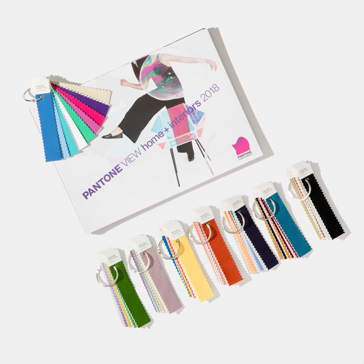
Here are five palettes that can appeal to anyone and everyone. The options cover an abundant amount of different types of styles and looks, so choose whichever one catches your eye!
Predicted Color Palettes
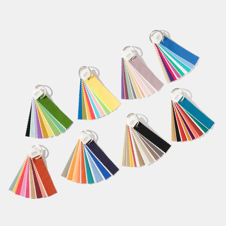
Intensity: The name alone already tells you how exciting this palette is going to be in your space. The darker, winter-esque colors give off a sophisticated, forest-like vibe, completely balanced with black and gold.
Playful: The word playful always makes us think of bright, young and fun! This one consists of bright yellow, lime and all other things fun! This color scheme gives of a youthful vibe and creates a “need to stop and smile,” said Eiseman.
Resourceful: Blue and orange. Two very distinct and powerful colors that somehow completely complement each other. Because the colors are so individual, they bring their own unique features to the room which work together to pull the entire place together. Eiseman said, “This is quite an interesting color combination. It combines warm and cool tones that you just can’t avoid looking at,” and we can’t wait to see it in action.
TECH-nique: Whenever turquoise is involved, we know it is going to be some eye candy! In addition the pink and purples are held together with Brilliant White and Frosted Almond. This palette is all about tones that, as Eiseman said, “seem to shine from within”.
Verdure: This palette has an undeniable Spanish influence. The blue and purple hues combined with the celery green create a fun, yet cozy and homey feel. The cool tones of blue, green and purple can create a sense of comfort for anyone.

Now that you have some leads and ideas for the upcoming year, go ahead and get started! Your friends and family won’t know what hit them!